It’s not “what you know”, it’s “who you know”. American saying
This part of the course is about how persons are embedded in a network structure, and how a network position can be related to advantages, and inequality on the aggregate network level. Before we discuss network position in these notes, let us learn how to producing smooth and meaningful visualizations (and how to emphasize network positions in visualizations of graphs).
Intended learning outcomes:
be able to effectively visualize networks
be able to use different network layouts (MDS, FR)
be able to calculate and interpret various centrality measures
be able to calculate and interpret network centralization (variation in centrality)
4.1 Visualization
Producing and examining a network plot is often one of the first steps in network analysis. The overall purpose of a network graphic (as with any information graphic) is to highlight the important information contained in the underlying data. However, there are innumerable ways to visually layout network nodes and ties in two-dimensional space, as well as using graphical elements (e.g.,node size, line color, figure legend, etc.) to communicate the story in the network data. In the next three chapters we go over basic principles of effective network graph design, and how to produce effective network visualizations in R. The purpose of this part is to introduce basic plotting techniques for networks in R, and discuss the various options for specifying the layout of the network on the screen or page. The following example shows how interpretation of a network graphic can be impeded or enhanced by its basic layout.
Network plots in igraph have a wide set of parameters you can set. We will discuss most below, but you can also check out ?igraph.plotting for more information.
If you plan on using the built-in color names, here’s how to list all of them: colors()
4.1.1 The data: Zachary’s karate-club
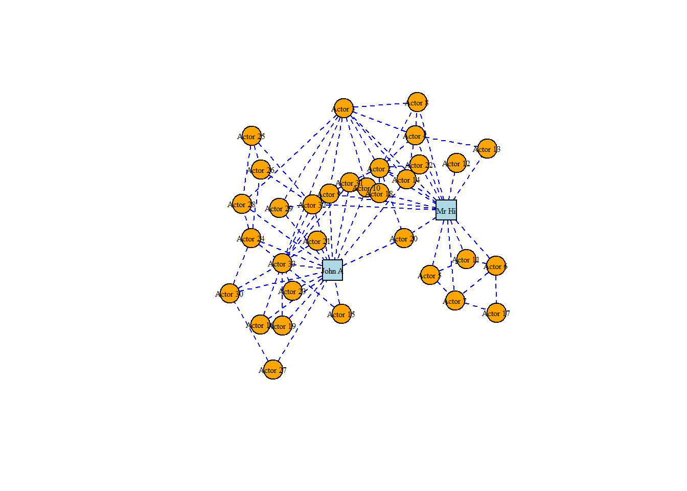
To illustrate we’ll use the famous Zachary’s Karate-club data (you can obtain it via the igraphdata package). This graph originates from a piece of research on a karate club by social anthropologist Wayne W. Zachary, and is commonly used as an example of a social network in many teaching situations today. The graph contains 34 vertices representing different individuals or actors. The karate instructor is labelled as ‘Mr Hi’. The club administrator is labelled as ‘John A’. The other 32 actors are labelled as ‘Actor 2’ through ‘Actor 33’. Zachary studied the social interactions between the members outside the club meetings, and during his study a conflict arose in the club that eventually led to the group splitting into two: one group forming a new club around the instructor Mr Hi and the other group dispersing to find new clubs or to give up karate completely. In this graph, an edge between two vertices means that the two individuals interacted socially outside the club.
data(karate)head(karate)
This graph was created by an old(er) igraph version.
  Call upgrade_graph() on it to use with the current igraph version
  For now we convert it on the fly...
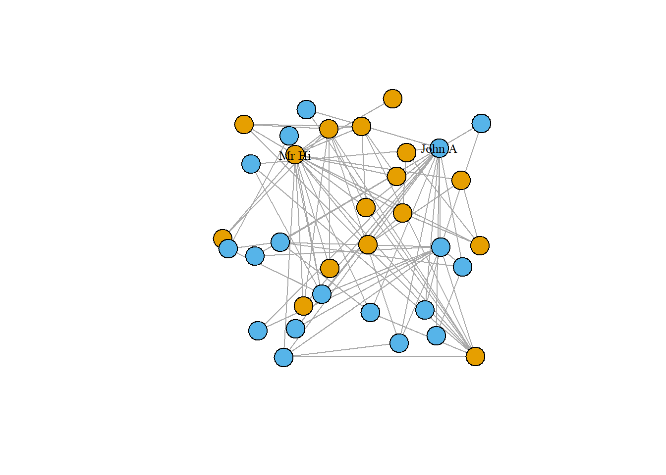
As we have seen in previous parts of the course the igraph package allows for simple plotting of graphs using the plot() function. The function works instantly with an igraph object, using default values for its various arguments. As a starting point, we will use all of the default values except for the layout of the graph. We will set the layout of the plot initially to be a random layout, which will randomly allocate the vertices to different positions.
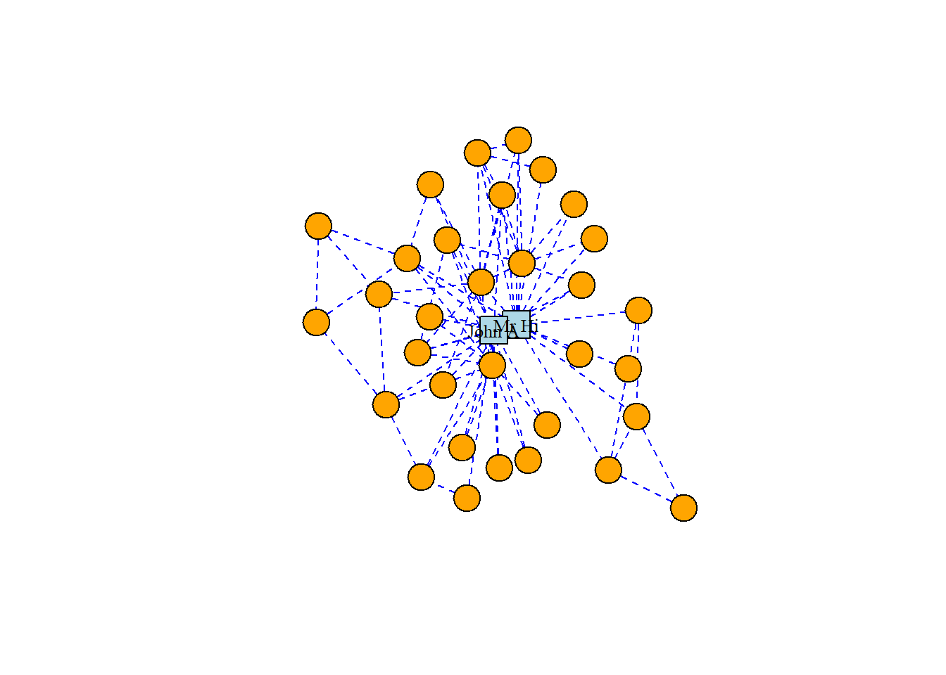
# set seed for reproducibilityset.seed(123)# create random layoutl <-layout_randomly(karate)# plot with random layoutplot(karate, layout = l)
Looking at the Figure we note that the labeling of the vertices is somewhat obtrusive and unhelpful to the clarity of the graph. This will be a common problem with default graph plotting, and with a large number of vertices the plot can easily turn into a messy cloud of overlapping labels.
4.1.2 Adjusting vertices
Vertex labels can be adjusted via properties of the vertices. The most common properties adjusted are as follows:
label: The text of the label
label.family: The font family to be used (default is ‘serif’)
label.font: The font style, where 1 is plain (default), 2 is bold, 3 is italic, 4 is bold and italic and 5 is symbol font
label.cex: The size of the label text
label.color: The color of the label text
label.dist: The distance of the label from the vertex, where 0 is centered on the vertex (default) and 1 is beside the vertex
label.degree: The angle at which the label will display relative to the center of the vertex, in radians. The default is -pi/4
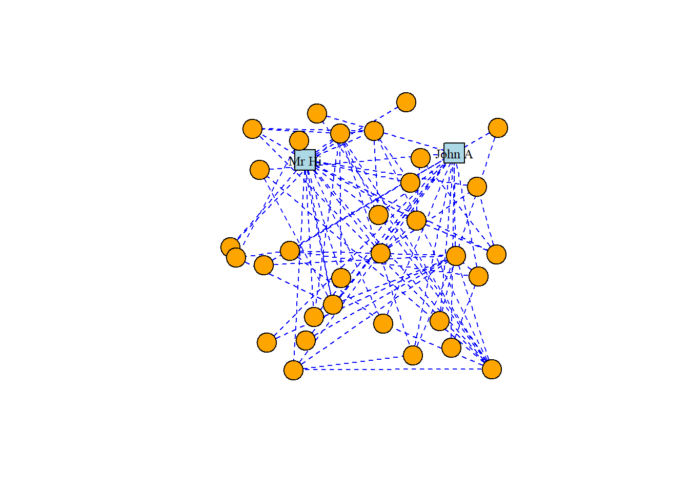
Let’s try to change the vertex labels so that they only display for Mr Hi and for John A. Let’s also change the size, color and font family of the labels.
# only store a label if Mr Hi or John A# %in%: A logical vector, indicating if a match was located for each element of # V(karate)$nameV(karate)$label <-ifelse(V(karate)$name %in%c("Mr Hi", "John A"),V(karate)$name,"")# change label font color, size and font family # (selected font family needs to be installed on system)V(karate)$label.color <-"black"V(karate)$label.cex <-0.8plot(karate, layout = l)
Now that we have cleaned up the label situation, we may wish to change the appearance of the vertices. Here are the most commonly used vertex properties which allow this:
size: The size of the vertex
color: The fill color of the vertex
frame.color: The border color of the vertex
shape: The shape of the vertex; multiple shape options are supported including circle, square, rectangle and none
# different colors and shapes for Mr Hi and and John AV(karate)$color <-ifelse(V(karate)$name %in%c("Mr Hi", "John A"),"lightblue", "orange")V(karate)$shape <-ifelse(V(karate)$name %in%c("Mr Hi", "John A"),"square", "circle")plot(karate, layout = l)
4.1.3 Adjusting edges
In a similar way, edges can be changed through adding or editing edge properties. Here are some common edge properties that are used to change the edges in an igraph plot:
color: The color of the edge
width: The width of the edge
arrow.size: The size of the arrow in a directed edge
arrow.width: The width of the arrow in a directed edge
arrow.mode: Whether edges should direct forward (>), backward (<) or both (<>)
lty : Line type of edges, with numerous options including solid, dashed, dotted, dotdash and blank
curved: The amount of curvature to apply to the edge, with zero (default) as a straight edge, negative numbers bending clockwise and positive bending anti-clockwise
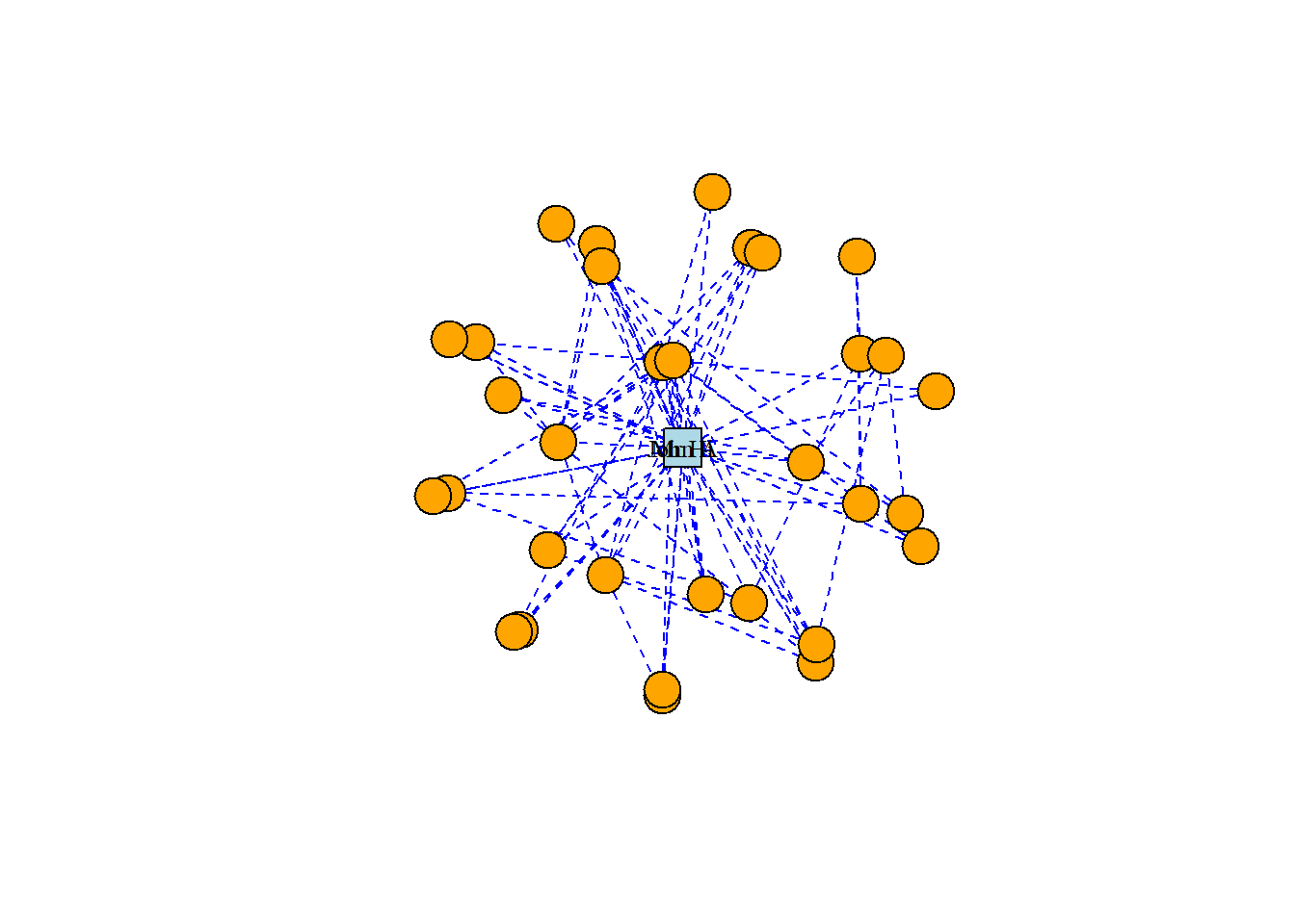
Note that edges, like vertices, can also have a label property and various label settings like label.cex and label.family. Let’s adjust our karate graph to have blue dashed edges, with the result in Figure 3.5.
# change color and linetype of all edgesE(karate)$color <-"blue"E(karate)$lty <-"dashed"plot(karate, layout = l)
4.1.4 Network layouts
The layout of a graph determines the precise position of its vertices on a 2-dimensional plane or in 3-dimensional space. Layouts are themselves algorithms that calculate vertex positions based on properties of the graph. Different layouts work for different purposes, for example to visually identify communities in a graph, or just to make the graph look pleasant. We preciously used a random layout for our karate graph. Now let’s look at common alternative layouts. Layouts are used by multiple plotting packages, but we will explore them using igraph base plotting capabilities here.
There are two ways to add a layout to a graph in igraph. If you want to keep the graph object separate from the layout, you can create the layout and use it as an argument in the plot() function. Alternatively, you can assign a layout to a graph object by making it a property of the graph. You should only do this if you intend to stick permanently with your chosen layout and do not intend to experiment. You can use the add_layout_() function to achieve this. For example, this would create a karate graph with a grid layout.
#check whether existing karate graph has a layout propertykarate$layout
NULL
# assign grid layout as a graph propertyset.seed(123)karate_grid <- igraph::add_layout_(karate, on_grid())# check a few lines of the 'layout' propertyhead(karate_grid$layout)
We can see that our new graph object has a layout property. Note that running add_layout_() on a graph that already has a layout property will by default overwrite the previous layout unless you set the argument overwrite = FALSE.
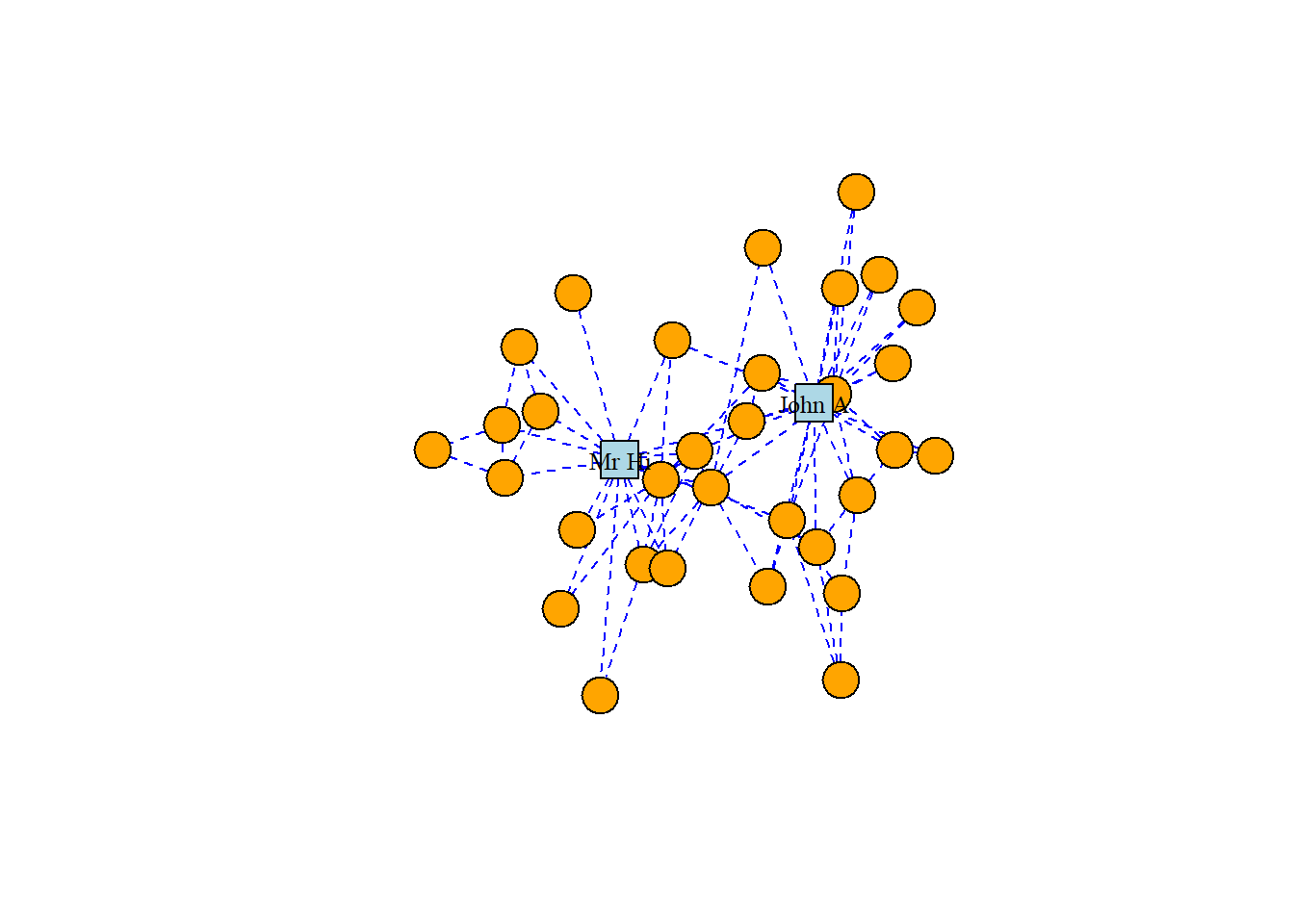
As well as the random layout demonstrated in Figure 3.2, common shape layouts include as_star(), as_tree(), in_circle(), on_grid() and on_sphere().
# circle layoutset.seed(123)circ <-layout_in_circle(karate)plot(karate, layout = circ)
Force-directed graph layouts are extremely popular, as they are aesthetically pleasing and they help visualize communities of vertices quite effectively, especially in graphs with low to moderate edge complexity. These algorithms emulate physical models like Hooke’s law to attract connected vertices together, at the same time applying repelling forces to all pairs of vertices to try to keep as much space as possible between them. This calculation is an iterative process where vertex positions are calculated again and again until equilibrium is reached. The result is usually a layout where connected vertices are closer together and where edge lengths are approximately equal.
For Zachary’s Karate Club study, which was a study of connection and community, we can imagine that a force-directed layout would be a good choice of visualization, and we will find that this is the case for many other network graphs we study. There are several different implementations of force-directed algorithms available. Perhaps the most popular of these is the Fruchterman-Reingold algorithm. The Figure below shows our karate network with the layout generated by the Fruchterman-Reingold algorithm, and we can see clear communities in the karate club oriented around Mr Hi and John A.
The Kamada-Kawai algorithm and the GEM algorithm are also commonly used force-directed algorithms and they produce similar types of community structures as in Figures 3.9 and 3.10, respectively.
As well as force-directed and shape-oriented layout algorithms, several alternative approaches to layout calculations are also available. An important alternative to force-directed approaches it the multivariate scaling technique. The purpose of multidimensional scaling (MDS) is to provide a visual representation of the pattern of proximities among a set of actors.
The MDS layout plots similar actors close to eachother, so actor 10 and actor 31 are similar. A drawback of the MDS layout is that similar actors are sometimes plotted on top of each others, which provides us with a less aesthetically pleasing visualization.
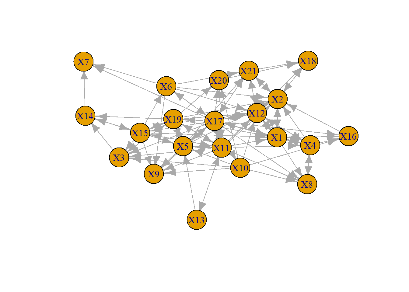
Above we exhibited several igraph.plotting aspects, however the aesthetic aspect. For a second practical example, we make use of the organizational network data from part 2. These data are from a well-known series of studies by David Krackhardt of a corporate hierarchy.
There a number of igraph.plotting options that are useful. The asp function was used before already (i prefer the aspect ratio 0.6 for the html output).
margin: Empty space margins around the plot, vector with length 4
frame: if TRUE, the plot will be framed
main: If set, adds a title to the plot
sub: If set, adds a subtitle to the plot
asp: Numeric, the aspect ratio of a plot (y/x)
palette: A color palette to use for vertex color
rescale: Whether to rescale coordinates to [-1,1]. Default is TRUE.
This plot is not really helpful. Let’s take some steps to improve the visualization. I add labels for the names (recall that the attribute label is now added to the igraph object friendship), but take care that this label is next to the vertex. The size is reduced, arrow size is reduced, edge is curved a bit.
A good drawing can also help us to better understand how a particular “ego” (node) is “embedded” (connected to) its “neighborhood” (the actors that are connected to ego, and their connections to one another) and to the larger graph (is “ego” an “isolate” a “pendant”?). By looking at “ego” and the “ego network” (i.e. “neighborhood”), we can get a sense of the structural constraints and opportunities that an actor faces; we may be better able to understand the role that an actor plays in a social structure.
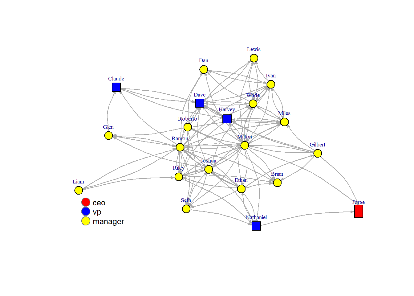
In our example we could be interested in the embedding of the different hierarchical levels (coded 1,2 and 3; 1=CEO, 2 = Vice President, 3 = manager)
First we create a vector color color <- c("red", "blue", "yellow"), after that color[V(friendship)\$level] is used to assign a color to the values in the “V(friendship)$level” vector. An alternative way is to create a color vector color<-V(friendship)\$level, and then assign the colors to the values in the vector color (color[1]<-“red”, color[2]<-“blue”,color[3]<-“yellow”).
Adjusting the size of nodes according to attributes can be useful as well, particularity if the size is proportional to a degree-like measure. It is clear in this visualization that some of the managers are well connected in the friendship network, the CEO and VP are less well connected (which is not necessarily bad).
It is common to adjust the appearance of edges as well. A classic example is the distinction between weak ties and strong ties (often the weak ties are depicted as dotted lines). In our example data we know whether a friendship nomitation is reciprocated or not. Based on this information we could construct an edge attribute “strength of tie” assuming that a reciprocated friendship nomination indicates that a tie is stronger.
Recall that we read the data into an adjacency matrix (matrix) that was used to create an igraph object. We use this matrix to calculate whether a nomination is reciprocated or not (this does not work well in igraph objects). By transposing and then adding the transposed matrix to the original we get a weighted network (0=no connection, 1=weak, 2=strong).
There is no single “right way” to represent network data with graphs. There are a few basic rules.Different ways of drawing pictures of network data can emphasize (or obscure) different features of the social structure. It’s usually a good idea to play with visualizing a network, to experiment and be creative.
4.1.5.1 Network Layouts
The layout options provided in igraph work algorithmically or heuristically, usually with some randomness. So, even with the same layout option, a different graphic layout will be produced each time the network is plotted. By setting a seed (set.seed) we can ensure reproducibility.
# this is a function to present two graphs in one figure (one row and two columns)par(mfrow=c(1,2))# set seed for reproducibilityset.seed(123)lmds<-layout.mds(friendship)lfr<-layout.fruchterman.reingold(friendship)plot(friendship, layout = lmds,vertex.label.cex=.6,vertex.size=6,vertex.label.dist=1.5,vertex.label.degree=-pi/2,edge.curved=.2,edge.arrow.size=.3,asp=1.4,main="Multidimensional scaling layout")plot(friendship, layout = lfr,vertex.label.cex=.6,vertex.size=6,vertex.label.dist=1.5,vertex.label.degree=-pi/2,edge.curved=.2,edge.arrow.size=.3,asp=1.4,main="Fruchterman Reingold layout")
graphics.off()
4.2 Centrality
In this section we look at measures of network centrality, which we use to identify structurally important actors. We also discuss possible ideas for identifying important edges. Centrality originally referred to how central actors are in a network’s structure. It has become abstracted as a term from its topological origins and now refers very generally to how important actors are to a network. Topological centrality has a clear definition, but many operationalizations. Network “importance” on the other hand has many definitions and many operationalizations.
There are four well-known centrality measures: degree, betweenness, closeness and eigenvector - each with its own strengths and weaknesses. The usefulness of each depends on the context of the network, the type of relation being analyzed and the underlying network morphology.
Every node-level measure has its graph-level analogue. Centralization measures the extent to which the ties of a given network are concentrated on a single actor or group of actors. We can also look at the degree distribution. It is a simple histogram of degree, which tells you whether the network is highly unequal or not.
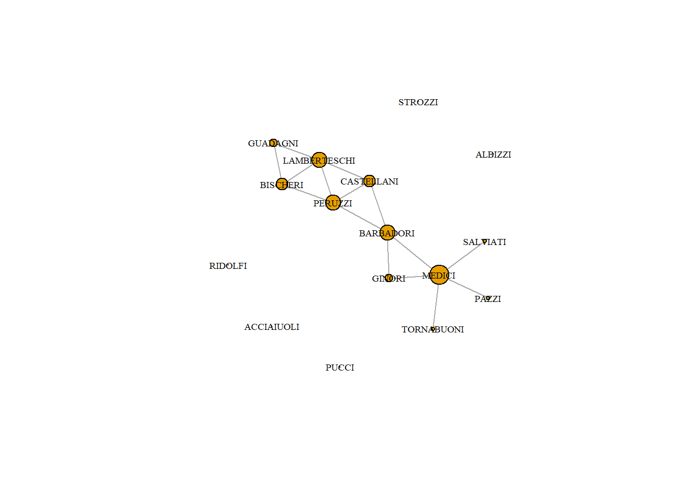
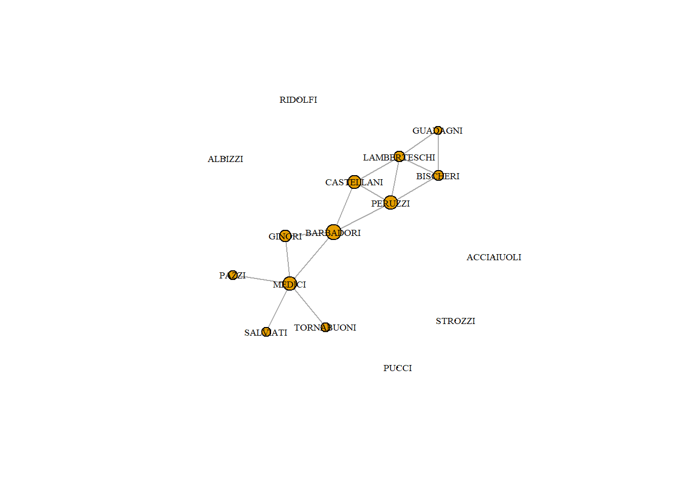
4.2.1 The Medici dataset
We will use John Padgett’s Florentine Families dataset. It is part of a famous historical dataset about the relationships of prominent Florentine families in 15th century Italy. The historical puzzle is how the Medici, an upstart family, managed to accumulate political power during this period. Padgett’s goal was to explain their rise.
He looked at many relations. We have access to marriage, credit, and business partnership ties, but we will focus on marriage and business partnerships for now. Marriage was a tool in diplomacy, central to political alliances (these relations were used in the lecture). We focus here on the business relations.
Based on this plot, which family do you expect is most central?
4.2.2 Degree Centrality
The simplest measure of centrality is degree centrality. As discussed in the previous part, it counts how many edges each node has - the most degree central actor is the one with the most ties.
Note: In a directed network, you will need to specify if in or out ties should be counted. These will be referred to as in or out degree respectively. If both are counted, then it is just called degree.
Degree centrality is calculated using the degree function in R. It returns how many edges each node has. Note that we first have to simplify the graph.
Betweenness centrality captures which nodes are important in the flow of the network. It makes use of the shortest paths in the network. A path is a series of adjacent nodes. For any two nodes we can find the shortest path between them, that is, the path with the least amount of total steps (or edges). If a node C is on a shortest path between A and B, then it means C is important to the efficient flow of goods between A and B. Without C, flows would have to take a longer route to get from A to B.
Thus, betweenness effectively counts how many shortest paths each node is on. The higher a node’s betweenness, the more important they are for the efficient flow of goods in a network.
In igraph, betweenness() computes betweenness in the network.
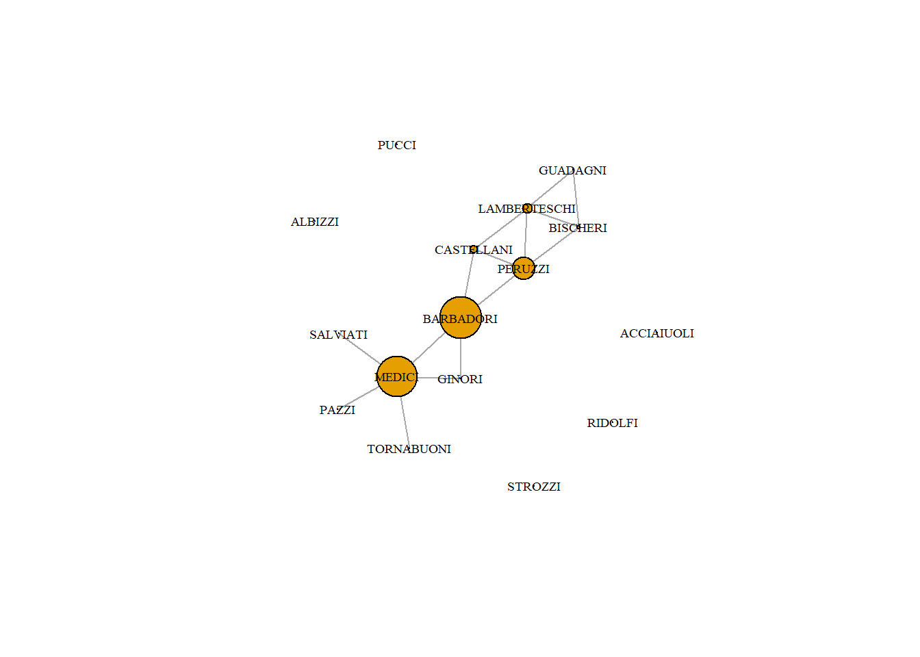
With closeness centrality we again make use of the shortest paths between nodes. We measure the distance between two nodes as the length of the shortest path between them. Farness, for a given node, is the average distance from that node to all other nodes. Closeness is then the reciprocal of farness (1/farness).
closeness(PB)
  ACCIAIUOLI      ALBIZZI    BARBADORI     BISCHERI   CASTELLANI       GINORI
         NaN          NaN   0.05882353   0.04000000   0.05000000   0.04545455
    GUADAGNI LAMBERTESCHI       MEDICI        PAZZI      PERUZZI        PUCCI
  0.03125000   0.04166667   0.05263158   0.03571429   0.05263158          NaN
     RIDOLFI     SALVIATI      STROZZI   TORNABUONI
         NaN   0.03571429          NaN   0.03571429
Note that the isolated families have an undefined distance to others in the network. Adjusting node size by closeness can only be done when replacing the NaN.
d <-closeness(PB)d[is.na(d)] <-0plot(PB,vertex.label.cex = .6, vertex.label.color ="black", vertex.size=d*200)
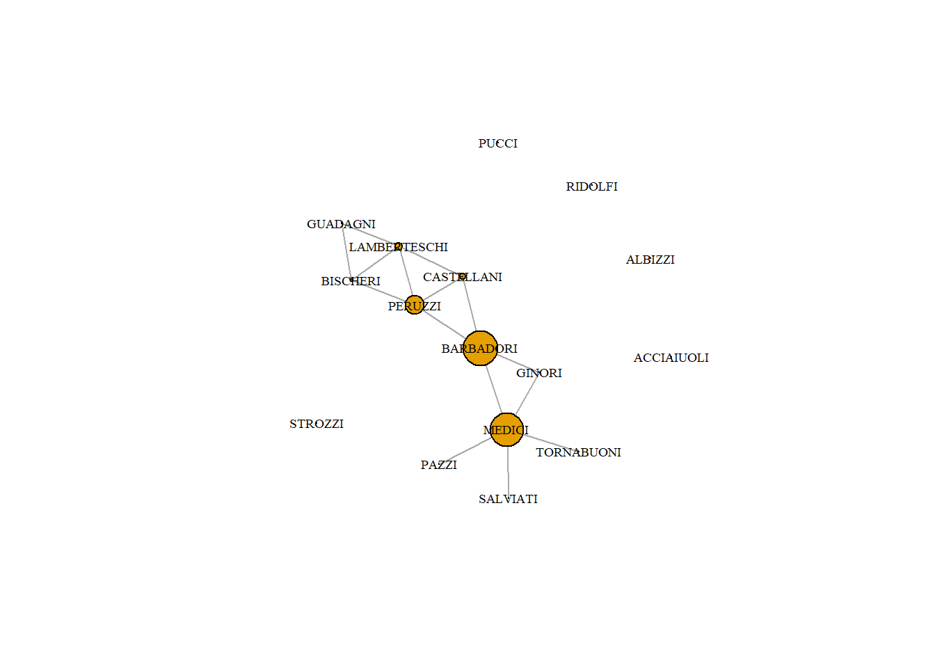
4.2.5 Eigenvector Centrality
Degree centrality only takes into account the number of edges for each node, but it leaves out information about ego’s alters.
However, we might think that power comes from being tied to powerful people. If A and B have the same degree centrality, but A is tied to all high degree people and B is tied to all low degree people, then intuitively we want to see A with a higher score than B.
Eigenvector centrality takes into account alters’ power. It is calculated a little bit differently in igraph. It produces a list object and we need to extract only the vector of centrality values.
Most of these measures are highly correlated, meaning they don’t necessarily capture unique aspects of pwoer. However, the amount of correlation depends on the network structure. Let’s see how the correlations between centrality measures looks in the Florentine Family network. cor.test(x,y) performs a simple correlation test between two vectors.
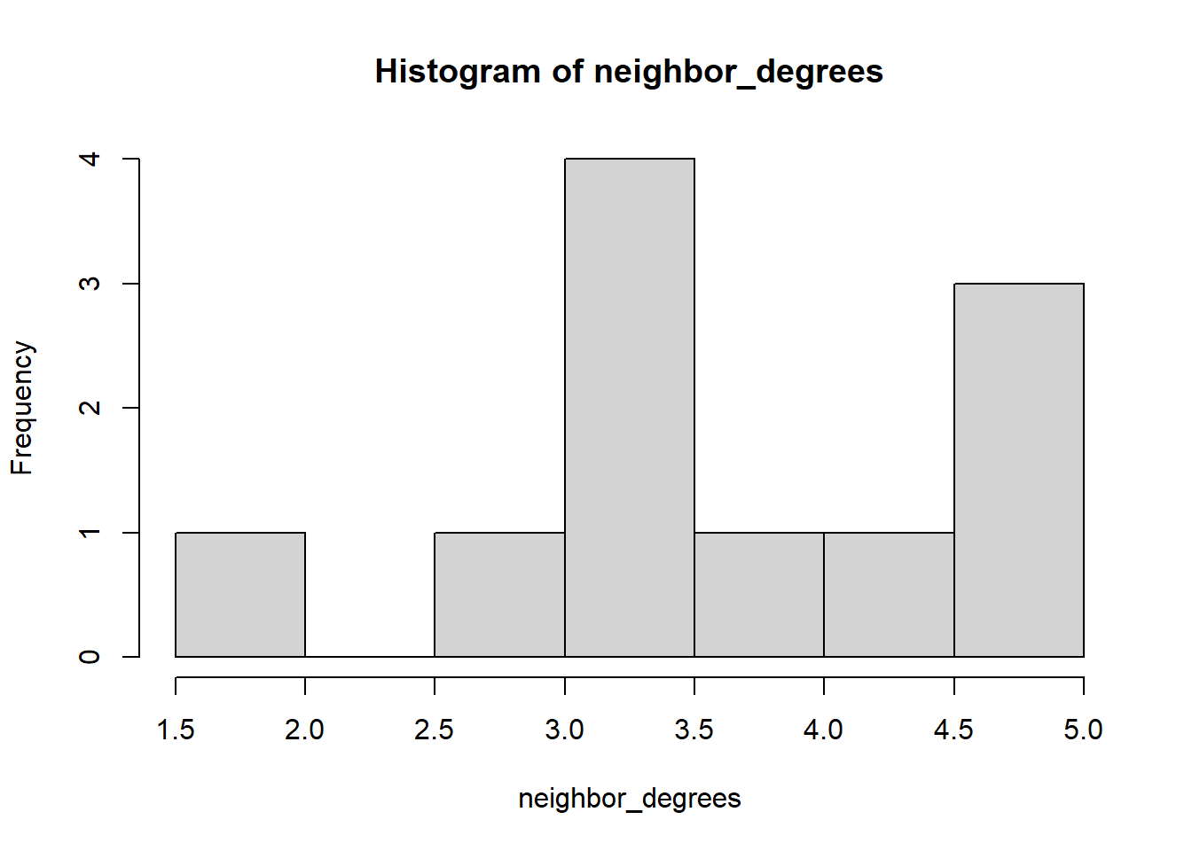
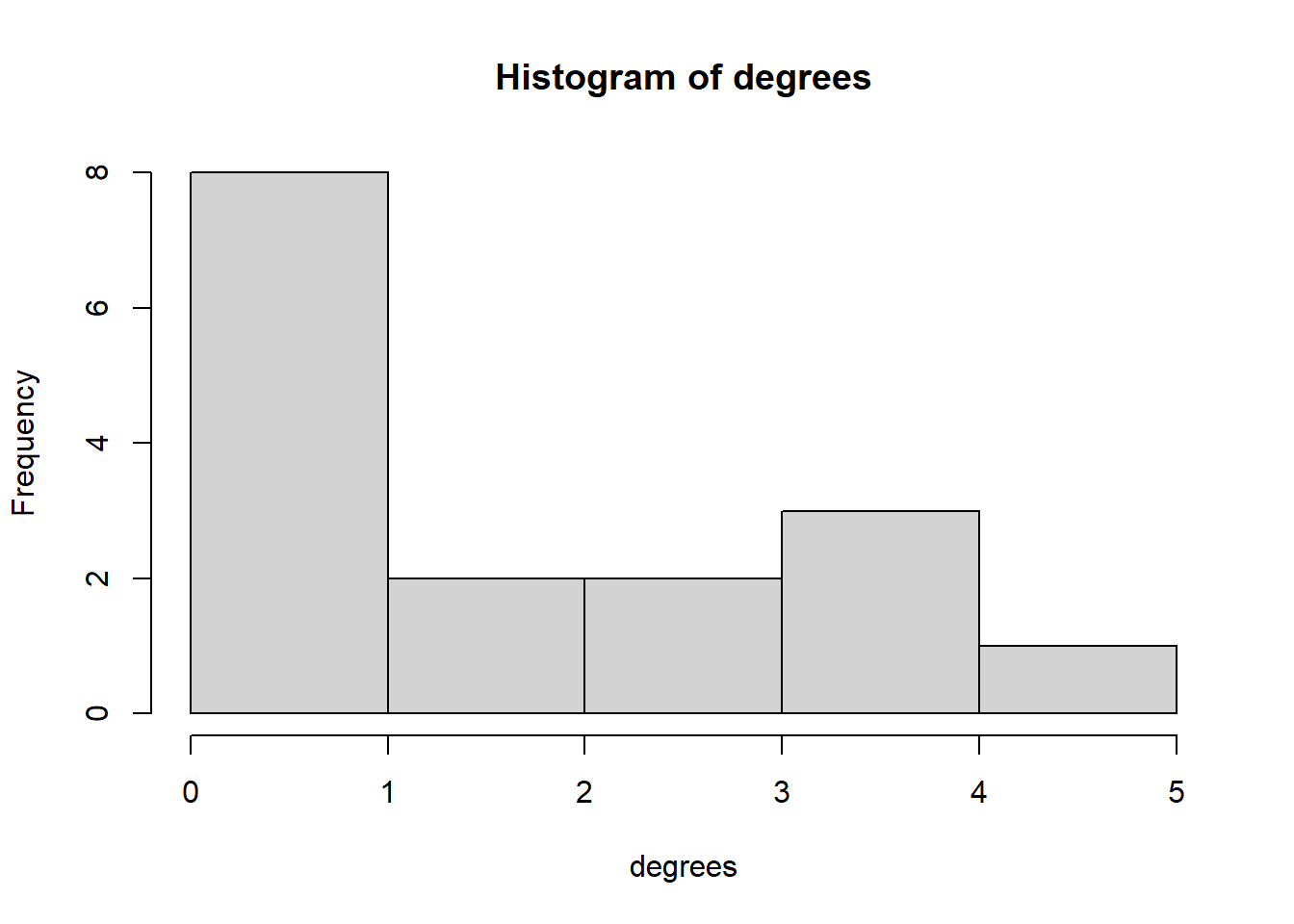
Marriage paradox: Do their marriage partners have more marriage partners than they do? We can use `knn’ command for this, which calculates the average neareast neigbor degree of a vertice.
# degrees of your friendsneighbor_degrees <-knn(PB)$knndegrees <-degree(PB)mean(neighbor_degrees, na.rm = T)
[1] 3.830303
mean(degrees)
[1] 1.875
# plot neighbor degrees vs. ego degreeshist(neighbor_degrees)
hist(degrees)
Note: We can see that most nodes in the marriage network have low betweenness centrality, and only one node has more than 40 betweenness. Degree distributions tend to be right-skewed; that is, only a few nodes in most networks have most of the ties. Evenly distributed degree is much rarer.
4.3 Variation in centrality
Centralization measures the extent to which a network is centered around a single node. The closer a network gets to looking like a star, the higher the centralization score will be. Below are two extreme network structure, on the one hand the Wheel structure (aka star structure) with a maximum variation in network centrality, on the other hand we have the circle network, with no variation of centrality scores.
In the golden age of social psychology a series of studies, the so-called “Bavelas-Smith-Leavitt experiments” was used to study how network structure could affect team problem solving. The figure below is a quick summary of the original experiment (from Burt et al. 2022). Five subjects are assigned at random to positions in the four displayed communication networks. The networks are simplified in that connections are all or nothing (no variable-strength connections) and access to each structural hole is all or nothing (no shared access).
Each subject is given a card containing five of the six symbols displayed at the top of the figure. One symbol is on all five cards. The team coordination task is to determine, as quickly as possible, which symbol is on all five cards. Seated around a card table passing written notes, subjects communicate through connections displayed in the figure. A trial is complete when all five teammates submit an answer. Completion does not depend on accuracy. After solving the task for the first trial, the team is presented with another, and another, until they complete all trials, or run out of time. Each trial task involves the same six symbols, but the particular symbol held in common during a trial varies from trial to trial.
Summary results from Leavitt (1949, 1951) are given in the table below the sociograms. Groups in the WHEEL network solve the problem more quickly (32.0 s versus 50.4 for the CIRCLE), involving fewer messages (43.0 messages per person versus 83.8 in the CIRCLE), but finish with a lower level of satisfaction (44.4 average survey response for people in the WHEEL on 100-point response to “How did you like your job in the group?” versus 65.6 for people in the CIRCLE).
The task was deliberately simple in the original experiment. Experiments with complex tasks soon followed the original. Sidney Smith, the person who designed the figure experiment run in 1948, subsequently ran a “noisy marble” version in 1950. Complexity is introduced by making more abstract the symbols on which subjects coordinate. The task is to identify which of six marbles teammates have in common. The initial 15 trials are simple in that the six marbles obviously differ by solid color (red, blue, black, yellow, green, and white). The subsequent 15 trials are complex in that the marbles differed by cloudy, mottled, indistinct colors. They were still easy to distinguish if they could be directly compared, but it was very difficult to describe each one clearly and unambiguously.” In other words, subjects in the complex trials of “noisy marble” had to coordinate on words to identify marbles in addition to determining which marbles each held.
Not surprisingly, coordination on complex tasks requires more time, involves more messages between subjects, more erroneous answers, and leaves subjects feeling less positive about the experience (succinctly shown in Shaw, 1954). More surprising and not anticipated by the researchers was the fact that the CIRCLE network is more effective than the WHEEL for coordination on a complex task. Subjects in the CIRCLE network show faster learning and submit fewer wrong answers. Christie et al. (1952) propose that the sharp difference between leader and follower in the WHEEL network — which is an advantage for simple coordination — is a disadvantage for complex coordination because followers are too passive in their confusion, and leaders too unaware of the confusion among followers. Teammate confusion is more apparent to teammates in the CIRCLE network, so they can deal with it. In corroboration, when the leader in the WHEEL network is given feedback at the end of each trial on the wrong answers submitted by teammates, their confusion was more evident to the leader, and WHEEL network performance improves visibly (Christie et al., 1952:141, 154).
4.3.2 Network structure, success and leadership perception
The renovated classic experiment described above was again used to study the whether access to so-called “structural holes” is associated with success, and perceptions of leadership. A structural hole can be understood as a gap between two individuals who have complementary sources to information. In the figure above in the CIRCLE network all actors are in fact bridging a structural hole. Actor A bridges a structural hole between actors B and E. In the CHAIN network actor A is not bridging a structural hole. In the figure the “holes” column is a so-called bridge count, which is a simple and intuitive measure of structural holes in a network. Bridge is defined as a relation between two individuals if there is no indirect connection between them through mutual contacts.
Structural holes theory was constructed by Ronald Burt, and was conceptually inspried by the strength of weak ties theory, the influential theory devised by Mark Granovetter (more about that theory in the diffusion network part of the course), and the betweenness centrality ideas discussed above. The theory is that structural holes are opportunities to broker information across groups separated by the holes, which gives people with access to structural holes information advantages of breadth, timing, and arbitrage, so such people — network brokers — are more likely to detect and develop good ideas into rewarding achievements.
in the experiment the hypothesis was that access to structural holes increases the odds that a person is perceived by colleagues to be a leader. People are perceived to be leaders when they behave as network brokers, which is to say, when they coordinate information across structural holes.
In the above figure the vertical axis is percent of citations to subject in response to question: “Did your group have a leader? If so, who?” Solid dots are mean number of citations received by subjects at the same level of network constraint.
The most readily recognized leaders are positioned as the hub in a WHEEL.The individuals least often cited as leaders are in small, closed networks — 0 %, 0 %, and 3 % respectively cited as leaders in the pendant positions of the WHEEL, CHAIN, and Y networks in the original study, 0 % cited here as leaders in the pendant positions of a WHEEL network, and 3 % cited as leaders in 3-person clique networks.
4.3.3 Illicit networks
The application of social network analysis to criminal phenomena has gained considerable attention. Network studies of crime often consider illicit networks, social networks in which actors seek to keep themselves and their activities concealed to avoid detection. Examples include secret societies, criminal enterprises, drug distribution networks, and terrorist networks. Illicit networks are goal oriented in that they operate to realize their objectives, such as collusion in a price-fixing scheme, trafficking illicit drugs, distributing stolen property, or executing a terrorist attack. The structure of illicit networks is influenced by the fact that the enterprise must accomplish its goals despite scrutiny and regulation from law enforcement and other official bodies. This makes illicit networks different from non-illicit networks. To some extent, these differences have led to a sense that illicit networks face a distinct trade-off between efficiency and concealment, with consequences for network structure. The most efficient communication network or task coordination structure might be one that makes the enterprise vulnerable to detection. However, structures that increase concealment (such as sparse communication networks) might be inefficient for accomplishing the enterprise’s tasks. Nevertheless, as Morselli (2009) points out, illicit networks requiring resource sharing are under pressure from law enforcement, and face constraints on the kinds of network structures that can be maintained.
Baker et al (1995) examined the link between risk and security within a network structure. Their study on the social organization of three segments in the heavy electrical equipment industry, in which collusion and price-fixing were prevalent, revealed the importance of players operating in the peripheries of a criminal network. These peripheral players were less targeted and less sanctioned than more central players. Remaining in the periphery was a way of protecting oneself.
At the group level, having a periphery (or lacking a clear-cut core) is a way of opting for security before efficiency: reducing risk in the network does have a trade-off in that each operation and the transmission of information take longer to process. Knowing that the risks associated with covert activities generally lead to the end of a network or the termination of the potential actions of targeted participants, a loss in efficiency clearly becomes an acceptable outcome for many participants. Thus, within the efficiency/security trade-off, security appears to be the predominant concern in criminal networks.
The study of Baker focused at organizations. Human illicit networks are similar in the sense that a trade off has to be made between efficiency and security. Erickson (1981) stressed the importance of security in covert networks from a social network perspective in her re-analysis of six case studies of secret societies under risk: the Auschwitz underground during World War 2; a rebellion group in 19th century China; a New York City Cosa Nostra family; a heroin market in San Antonio, TX; a sample of marijuana consumers from Cheltenham, England; and a Norwegian resistance group during World War 2. She argued that when networks are obliged to choose between efficiency and security, organizational structures with a proven level of endurance and an established reputation opt for the latter. Her key point was that in order to understand the structure of a network, the “conditions under which they exist” must first be appreciated (p. 189). Risky conditions generally lead participants to assure security within the network. One way the network members of Erickson’s case studies achieved this was by relying primarily on pre-existing networks that formed the foundation upon which each secret society was designed to compensate for risk.
4.4 Exercise
The data arose from an early experiment on computer mediated communication. Fifty academics interested in interdisciplinary research were allowed to contact each other via an Electronic Information Exchange System (EIES). The data collected consisted of all messages sent plus acquaintance relationships at two time periods (collected via a questionnaire).The data includes the 32 actors who completed the study. In addition attribute data on primary discipline and number of citations was recorded. TIME_1 and TIME_2 give the acquaintance information at the beginning and end of the study. This is coded as follows: 4 = close personal fiend, 3= friend, 2= person I’ve met, 1 = person I’ve heard of but not met, and 0 = person unknown to me (or no reply). NUMBER_OF MESSAGES is the total number of messages person i sent to j over the entire period of the study. The attribute data gives the number of citations of the actors work in the social science citation index at the beginning of the study together with a discipline code: 1 = Sociology, 2 = Anthropology, 3 = Mathematics/Statistics, 4 = other.
Edges are in “Freeman’s_EIES.xlsx”. Nodes in “Freeman_EIES_Attribute.xlsx”.
Read the data, a relation should indicate that a tie is a friend (so code 3 & 4).
Plot the network, include department attribute, make vertex size proportional to scientific impact
Plot and compare a MDS and FR layout.
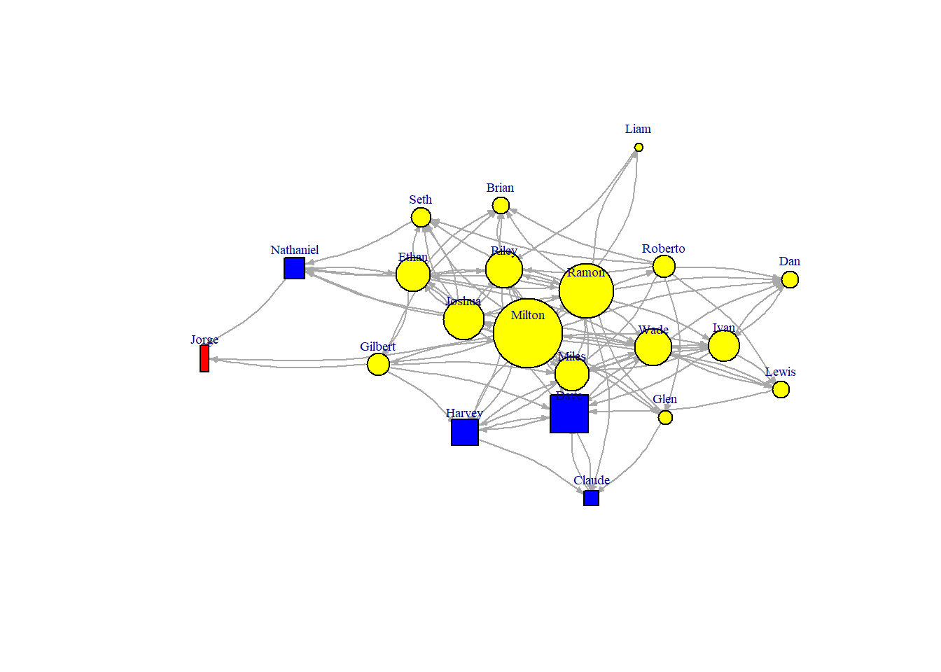
There are two illicit network datasets at your disposal. Compare a gang (MONTREALGANG.csv) and terrorist network (MALI.csv). What do you expect a priori?
Who is the most important actor in the Montreal network? Why?
Who is the most important actor in the Mali network? Why?